Nov 24, 2025
Bolt Rebuilds: How to add assets to your project
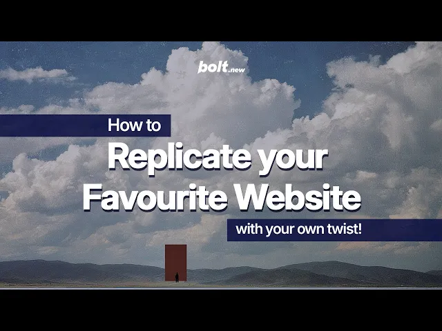
The first of many website replication tutorials. This week, we learn how to add assets to projects in Bolt by rebuilding the Chainsmoker's distinctive homepage.
Insights
Website replication is one of the fastest ways to sharpen your design eye (and one of the best ways to learn a ton about Bolt’s superpowers). Plus, replicating websites you love and adding your own unique twist can help you discover your style.
Builder, designer, and super-user Jakub Skrzypczak recently walked through how to rebuild the Chainsmoker’s simple but striking website from scratch, all with Bolt. No code required.
If you’ve got 11 minutes to spare, check out the youtube video below to see Jakub’s tutorial.
If you’d rather skim through the directions yourself, read on.
Step 1: Break down the layout
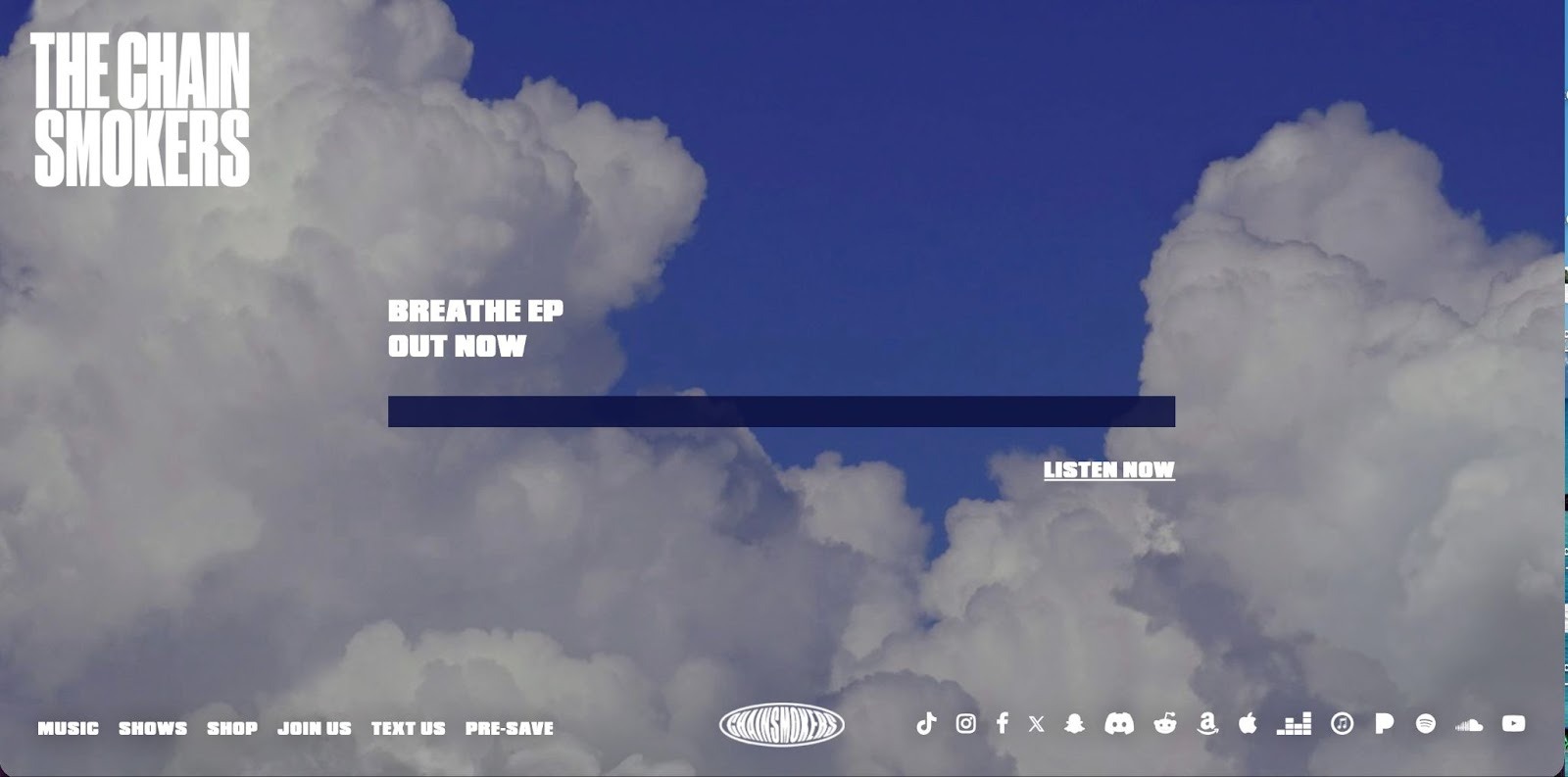
The Chainsmokers’ site looks dramatic and complex at first glance, with big imagery, neon accent colors, and asymmetric text placement. But when you overlay a simple grid, the structure becomes pretty straightforward.
With a bit of analysis, Jakub broke it down to its essential parts and landed on the following prompt.
Prompt 1
Top row: Their signature black logo in the top-leftMiddle row:Two lines of left-aligned copyA solid blue horizontal dividerOne line of right-aligned copy beneath it
Bottom row:Left: Navigation listCenter: LogoRight: Social icons
Background image: clouds
The website should be full screen, no scroll, make sure it looks good on all viewports!
He also uploaded a screenshot of the original homepage so Bolt could read the visual context:
By stripping out fonts, colors, and exact spacing at the beginning, Jakub zeroed-in on getting that structure right inside Bolt.
Bolt’s output wasn’t a perfect match yet, but the structure was correct, which is exactly what we want in the first iteration. The logos were placeholders, the divider color wasn’t exact, and the font didn’t match the brand yet, but every component was in the right place.
Step 2: Pull the real Chainsmokers assets using inspect
To match the original more closely, the next step was to grab actual assets from the live site.
Prompt 2
Use this image for the top-left logo: https://thechainsmokers.com/images/logo-white.png
Prompt 3
Use this for a background image: https://thechainsmokers.com/images/bg-breathe.jpgUse this for the bottom logo: https://thechainsmokers.com/images/logo-small-white.png
Step 3: Match size, spacing, and typography
Once the right assets were in place, the gaps were mostly visual: the top logo was small and the middle text was large, for example.
Rather than manually adjusting values, he used the following prompts:
Prompt 4
Make the top left logo 2x biggerLet's make the middle section copy 3x smaller
Each prompt produced a refined version within seconds.
Step 4: The blue divider
One of the most distinctive visual elements on the Chainsmoker’s site is the navy blue divider cutting through the center.
Using Inspect, he copied the exact CSS, including:
Background color
Opacity
Height
Width
Margin
Then pasted it into Bolt.
Prompt 5
For our middle blue rectangle divider, please use this style:background-color: #090e3f;height: 30px;width: 100%;margin: 30px auto;opacity: .85;
Step 6: Refine
Next, a few visual refinements bring the replica even closer to the original Chainsmoker’s layout. The below prompt tightens the spacing between the headline and the blue divider, caps the divider’s width to match the real design, scales down the bottom logo, and more.
Note: Sometimes when Bolt updates certain aspects of your build, other aspects get jostled in the process. A simple prompt is generally enough to nudge Bolt to fix anything that’s been changed inadvertently.
Prompt 6
Reduce the space between 'BREATHE EP OUT NOW' copy and the rectangle blue dividerMake the max blue divider width 760pxAlign the bottom section elements verticallyMake the bottom logo smallerChange the font to Bowlby One
Prompt 7
The copy in the middle section should still be aligned to the blue rectangle divider as beforeUse bowlby font also for the bottom navigationCenter align the bottom logo relative to the viewport please :)
Prompt 8
Lets make the bottom left nav items a bit smaller :)
Step 7: Add a custom visual twist with an animated background
Once the replicated homepage was accurate, Jakub added a subtle animated cloud motion effect.
He used Paper Design, a shader generator, and selected the Smoke Ring effect. After adjusting a few parameters, he exported the shader and pasted it into Bolt.
Prompt 9
Use this as our background:
/** @paper-design/[email protected] */
import { SmokeRing as SmokeRing1 } from '@paper-design/shaders-react';
/**
Code exported from Paper
https://app.paper.design/file/01KA8RCNV39X1VB1GJ586S09D3?page=01KAB8BH9BFSF3WPJY8HT3B2HC&node=01KAB8CX94WWJSQYEF4SYTMCG9
on Nov 20, 2025 at 12:32 PM. */ export default function SmokeRing() { return <SmokeRing1 speed={0.68} scale={2} thickness={0.33} radius={0.55} innerShape={0.7} noiseScale={3} noiseIterations={3} offsetX={0} offsetY={-0.25} colors={['#D5CFCE']} colorBack="#00000000" frame={853570.7419997603} style={{ backgroundImage: 'url(https://workers.paper.design/file-assets/01KA8RCNV39X1VB1GJ586S09D3/01KAB8CTA19HC8173YE4W9GV0H.jpg)', backgroundPosition: 'center', backgroundSize: 'cover', height: '760px', width: '1500px' }} />; }
The prompt above produces a smooth, animated cloud-motion effect behind the Chainsmoker’s artwork, preserving the aesthetic of the original while giving it modern depth and movement.
Final result: A near-perfect replica with a custom upgrade
The finished version:
Matches the original layout
Uses the real assets
Has nearly identical spacing, sizing, and typography
Adds a motion background that brings the page to life
And it took 11 minutes.
Want to try it for yourself? Type your first prompt into Bolt now.


