Dec 2, 2025
Bolt Rebuilds: Importing & customizing open source components for your site
The second edition of Bolt Rebuilds. In this one, we walk through importing and customizing open source components using the Huly.io site.
Insights
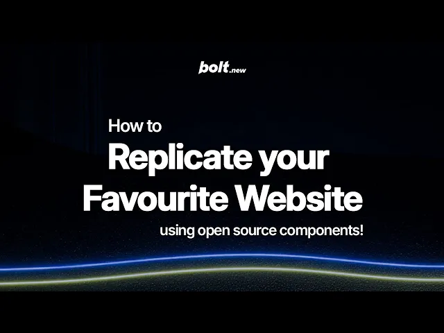
In this article, the second installation of our Bolt Rebuilds series, we’re walking through how to import and customize open source components using Huly.io’s website. If you want to see our first Bolt Rebuilds post where we learn how to add assets to a project, find it here.
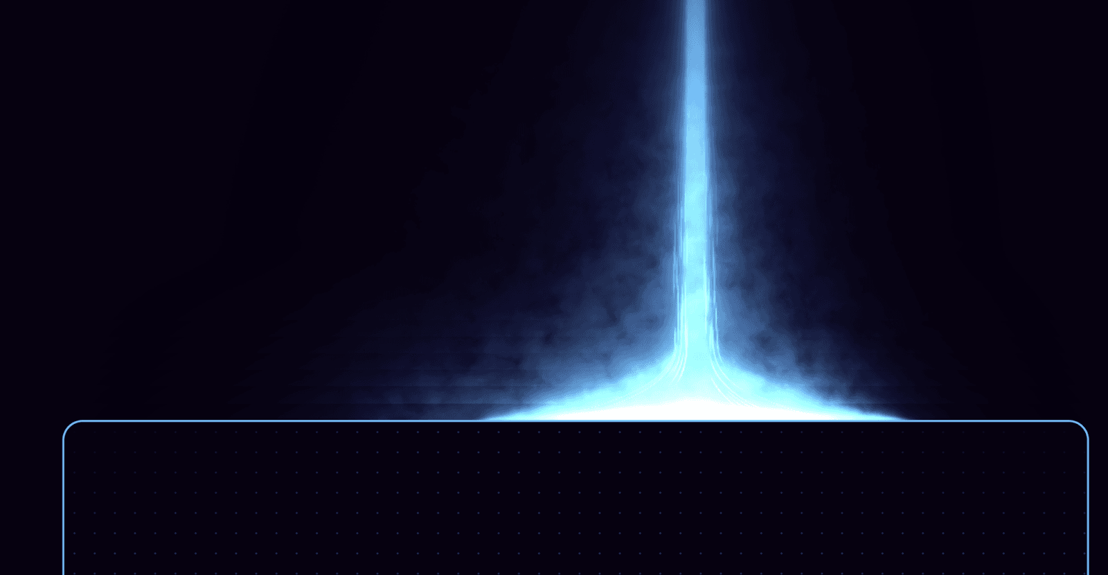
Some websites have a signature visual moment: a section or component so distinct it characterizes the entire aesthetic. For Huly.io (an open source project management platform), it’s the hero: a striking laser-beam animation paired with a glowing call-to-action button.
This bold, futuristic design makes a lot of sense for a bleeding-edge software tool. For those building software themselves, designer and Bolt super-user Jakub Skrzypczak walked through how to recreate that same vibe in Bolt using open-source components, a few simple prompts, and some basic customization.
Check out the video below for the visual tutorial or read on to jump straight to the prompts.
Here’s what we’ll cover:
Finding and import open-source React components
Structuring your hero layout with Bolt prompts
Customizing properties like color, opacity, speed, and sizing
Replacing default CTAs with a glowing, animated button
Balancing visual intensity so your page feels intentional, not overwhelming
Adapting the final design to your own content and brand
Let’s get into it.
Step 1: Understanding what makes Huly’s hero work
Huly’s hero includes two strong visual anchors: the laser beam background animation and the glowing CTA button. Importantly, nothing else really competes with these two elements.
Laser beam background animation
This is the centerpiece of the design. On Huly.io, it’s actually just a looping 4-second MP4, but we’ll recreate the effect using an open-source React component instead.
Glowing CTA button
The hero’s call-to-action uses a soft, animated glow that pulses on hover. It draws your eye immediately without overpowering the layout.
These two elements do all the heavy lifting. Everything else is intentionally minimal.
Step 2: Finding the right open source components
The web is full of free components created by design engineers. Some of Jakub’s favorites:
Exploring these libraries regularly is the fastest way to build a mental map of what’s possible. The more you browse, the easier it becomes to recognize the right component for the job.
For this rebuild, Jakub already knew exactly where to look:
For the Laser-beam animation: LaserFlow from React Bits (originally inspired by the Huly hero!)
Glowing CTA button: A neon-style button from 21st.dev with a hover glow and soft pulse animation.
These two components will give us a nearly identical vibe with zero reinventing.
Step 3: Importing the components into Bolt
Before pasting anything into Bolt, we need to give it the right framing:
Prompt
We're building a hero section of a landing page!
DO NOT add any other content than the component i’m going to paste below. This component will serve as a background of our hero section.
It should look roughly like the reference image i’m attaching.

[Copy code from https://www.reactbits.dev/animations/laser-flow
Copy both ‘code’ and ‘usage’ code snippets]
We paste both into Bolt, enter Plan Mode, and hit Build.
Within seconds, Bolt renders the hero with the imported laser-beam background.
Note: In Plan Mode, Jakub got three clarifying questions. Below are the questions and how he answered them in case you run into the same ones.
Bolt Clarification Questions:
Do you want any specific headline text or content for the hero section, or should I create placeholder content that you can customize later?
Should there be any interactive elements beyond the mouse-tracking laser effect (like parallax scrolling, animated text, or interactive CTAs)?
What color scheme would you prefer for the laser beam - the reference shows pink/magenta, but would you like to stick with that or use a different color that fits your brand?
My answers:
no content at all besides the component
everything 1:1 as in the usage snippet
let's go for blue :)
Step 4: Establishing Layout Before Adding the Button
Before introducing the CTA button, we set up the rest of the hero’s structure:
Navigation bar
Heading
Subheading
CTA placeholder
Prompt:
let's add a basic navbar with just text logo on the left, a few items next to the logo and cta on the very right
add h1 + subcopy + cta button aligned to the left border of the laserflow component rectangle frame, positioned to the left of the laser beam, well above the rectangle top border
The result:
A clean hero layout that mirrors Huly’s structure. even before we customize anything.
Step 5: Replacing the default CTA with the glow button
Now we swap in our glowing open-source CTA.
Prompt
replace this button with this component:
[Copy the code from: https://21st.dev/community/components/shadway/animated-generate-button-shadcn-tailwind/default]
The hover glow triggers instantly in the preview. This is your primary “money button”. It’s impossible to miss.
Step 6: Styling the nav bar CTA without competing with the hero
Huly uses a classic hierarchy technique: primary CTA in the hero, secondary CTA in the nav.
We don’t want the secondary CTA to overshadow our primary CTA, so we don’t reuse the glow button in the nav bar. Instead, we use a lighter outline style.
PromptFor the nav bar cta - make it similar to the other nav bar items, just add an outline pill container around it that highlights on hover, same border radius as the hero CTA
Bolt produces a subtle, balanced nav button that complements but doesn’t compete.
Step 7: Customizing the component colors and properties
Most users rely solely on prompts to customize their site in Bolt. This works just fine, but Jakub demonstrated a second, equally powerful method for making tweaks: customizing props directly in the code Bolt generates.
With React Bits components, this is incredibly easy because every prop is documented.
For example:
colorhorizontalSizingwispSpeedopacitywidthscale
You can:
Change the laser color
Adjust speed
Change sizing
Swap opacity
Customize gradients
Here’s what that looks like:
Search for the prop name (like
color) insidelaserflow.tsx.Update the value (e.g., switch to a new pink hex code).
Save.
Preview instantly.
No tokens or prompts required. Just quick adjustments inside Bolt’s editor.
Step 9: Creating variants (same component, different effects)
The above tutorial shows you how to create the Huly homepage, which features a left-aligned hero. But there’s a ton of versatility possible with the components we used for this project.
With just a few simple prompts, you can totally change the font, vibe, or content of your homepage while maintaining the distinctive style and visual elements of the Huly site.
Below are a couple simple prompts for changing the kind of content you display in your hero section.
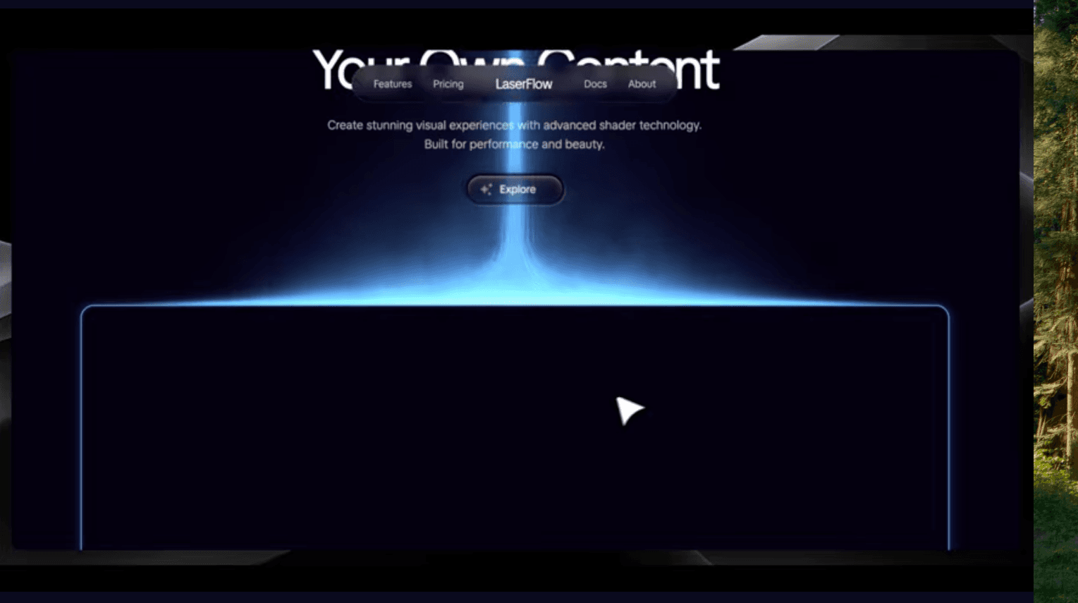
Own content
Link: https://chat-great-w68e.bolt.host/
Rmx: https://bolt.new/~/sb1-aljbzaeh
Result:
First prompt:
create a landing page with those modifications:
move the laser beam to the middle
navigation bar should have logo in the center, nav bar items on both left and right, no cta
navbar should be in a semi transparent pill container
h1 should be centered and center aligned
Second prompt:
add one more nav bar item so it's symmetrical and change all the fonts to tiktok sans please
Note:
I’ve been playing a bit with the parameters of the laser beam and some small bits directly in the code, which - again - I highly recommend you to do as well :)
YT embed content
Result:
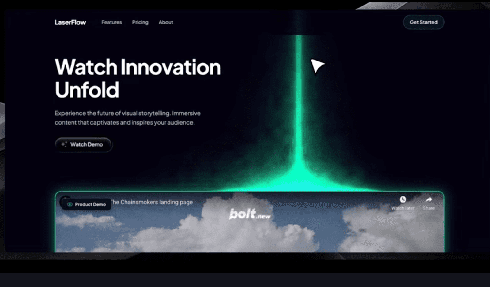
First prompt
Adapt this page to a modern landing page with a fixed navigation bar at the top featuring "LaserFlow" branding and a "Get Started" button. The hero section should have:
Heading: "Watch Innovation Unfold"
Subheading: "Experience the future of visual storytelling. Immersive content that captivates and inspires your audience."
A prominent CTA button labeled "Watch Demo"
Use Plus Jakarta Sans font (weights: 400, 500, 600, 700)
In the rectangle component under the laser flow:
An embedded YouTube video player (16:9 aspect ratio)
Emerald green border (#10B981) with subtle glow
Small badge overlay showing "Product Demo" with a YouTube icon
For the animated laser flow user these properties:
Emerald green color (#10B981)
Second prompt
let's left-align this div with the left border of our rectangle frame please :)
Note: You’ll also need to replace the YT placeholder with your own content either directly in the code (as I did) or ask Bolt to replace the vid in the chatbox!
Mock chatbox content
Link: https://chat-great-w68e.bolt.host/
Rmx: https://bolt.new/~/sb1-aljbzaeh
Result:
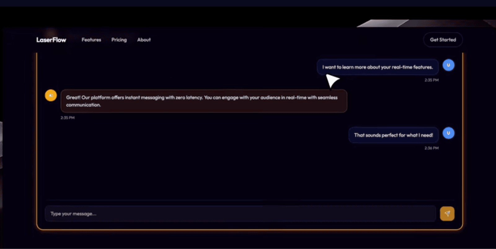
Prompt:
Adapt this page to a modern landing page with a fixed navigation bar at the top featuring "LaserFlow" branding and a "Get Started" button. The hero section should have:
Heading: "Connect in Real Time"
Subheading: "Instant conversations that matter. Engage with your audience through seamless, real-time communication."
A prominent CTA button labeled "Start Chatting"
Use Outfit font (weights: 400, 500, 600, 700)
Below the hero, place a large rounded rectangle container with:
An interactive chat interface showing 3-4 mock messages alternating between AI and user
Message bubbles with avatar circles (AI in amber, User in blue)
Timestamps on each message
Chat input field at bottom with send button
Amber/orange border (#F59E0B) with warm glow
For the animated laser flow use these properties:
Amber/orange color (#F59E0B)
I used Plan mode and received those questions, so Q&A:
For the mock chat messages, would you like me to use generic placeholder text, or do you have specific conversation content in mind that would showcase the real-time communication theme?Should the chat interface be fully interactive (allowing users to type and send messages), or is this purely a demonstration/preview interface for the landing pageWould you like the AI and User avatars to display specific icons from lucide-react, or should they show initials (like "AI" and "U")?
My answers:
generic placeholderpurely a previewinitials are fine :)
Step 10: Always add attribution
Open-source components are free, but most require attribution.
Add a comment at the top of the file giving credit to React Bits and 21st.dev. It's a small detail, but it’s important.
Tip: The design principle that makes this work
One golden rule from the video: Just because you can add more components doesn’t mean you should. Visually heavy components like laser animations or neon buttons should be used sparingly (keep it to 1 to 3 per section).
Too many animations creates cognitive overload. Huly succeeds because it’s focused. Your rebuild should aim for the same restraint.
Final Result: The Huly hero rebuilt in Bolt
In just a few minutes, we rebuilt:
The laser-beam background
The glowing CTA
Navigation
Layout
Typography
Color customizations
Even alternate versions
…without writing a single line of manual code.
This is the power of combining Bolt with the open-source ecosystem. You get the creativity of modern design engineering and the speed of AI-powered development.
Got an idea? Build it with Bolt.